
Sip A Cup: A Café's first website
Creating a responsive web design for a local coffee-shop's first website
Role:
UX Researcher, UX&UI Designer, Wireframing, Prototyping
Tools:
Figma, UsibilityHub, Google Meets
Duration:
80 Hours
Sip A Cup: A Café's first website
Creating a responsive web design for a local coffee-shop's first website
Role:
UX Researcher, UX&UI Designer, Wireframing, Prototyping
Tools:
Figma, UsibilityHub, Google Meets
Duration:
80 Hours
Background and Problem
For this project I worked together with Sip A Cup to design their first website. Sip A Cup is a family-owned small business founded in 2019 in Astoria, New York. It is a cozy coffee shop/café selling a large variety of drinks such as coffee, tea, and small bites. They have been steadily growing their business and are interested in expanding further by adding an website. With Instagram being their only social media account, Sip A Cup lacks an online presence and wants a well-designed website to establish a digital identity and enhance the overall user experience.
Solution
Create a responsive website that effectively communicates the brand and menu offerings while providing convenient features that enable customers to easily access information and order online. The website should not only attract new customers but also engage and retain existing ones.
Empathize: Learning the Wants and Needs of a Customer
Research Goal
To discover common trends of café websites in order to create a product that is familiar and inviting to new as well as previous customers.
To identify what individuals like and dislike about café websites to address common issues one might have with existing café websites.
Research Objectives
Understand why people would visit a cafe’s website, and what content they want to see (menu, address, number, etc)
Find out if people usually visit a coffee shop’s website
If ordering online was an option, what do they like/ dislike about the process
Discover common/ popular features of well-known and niche cafes that could be of interest.
Discover unique features that individuals would like to see
Competitive Analysis: Gaining Insight of Industry Peers
I examined the websites of Starbucks, Matto, Dunkin and Moa Coffee to gain insights into their online presence and user experience in the cafe industry. By evaluating these competitors, I identified notable strengths and areas for improvement in their website experiences. I was able to gather valuable insights to inform the design and functionality of Sip A Cup's website, ensuring it effectively communicates their brand, showcases their menu offerings, and provides a seamless user experience that attracts and engages customers.
Prioritized minimalist design, visually appealing imagery
They have coffee for a very affordable price and assorted breakfast goods that are not listed on their site
They lack of food menu online, may be due to a changing selection daily at different locations

Well-established and comprehensive website, emphasizing brand storytelling, seamless navigation, and a user-friendly ordering process
They serve all types of Coffee with breakfast, lunch bites and small desserts
They lack enticing deals to bring in more customers

Straightforward menu access and streamlined online ordering
They sell drinks, Famous donuts and breakfast/lunch sandwiches
They have a lot of drinks and food but could have better marketing for their website and app
They are a coffee shop that does coffee, drinks, and baked goods
Their website is missing important information such as a menu and the site has formatting errors
User Interviews and Survey
Both user interviews and surveys were used to understand what individuals expect from café websites as well as gain insight on how my client’s customer base felt about a potential website. I interviewed 4 individuals and conducted a survey with a total of 16 unique responses.
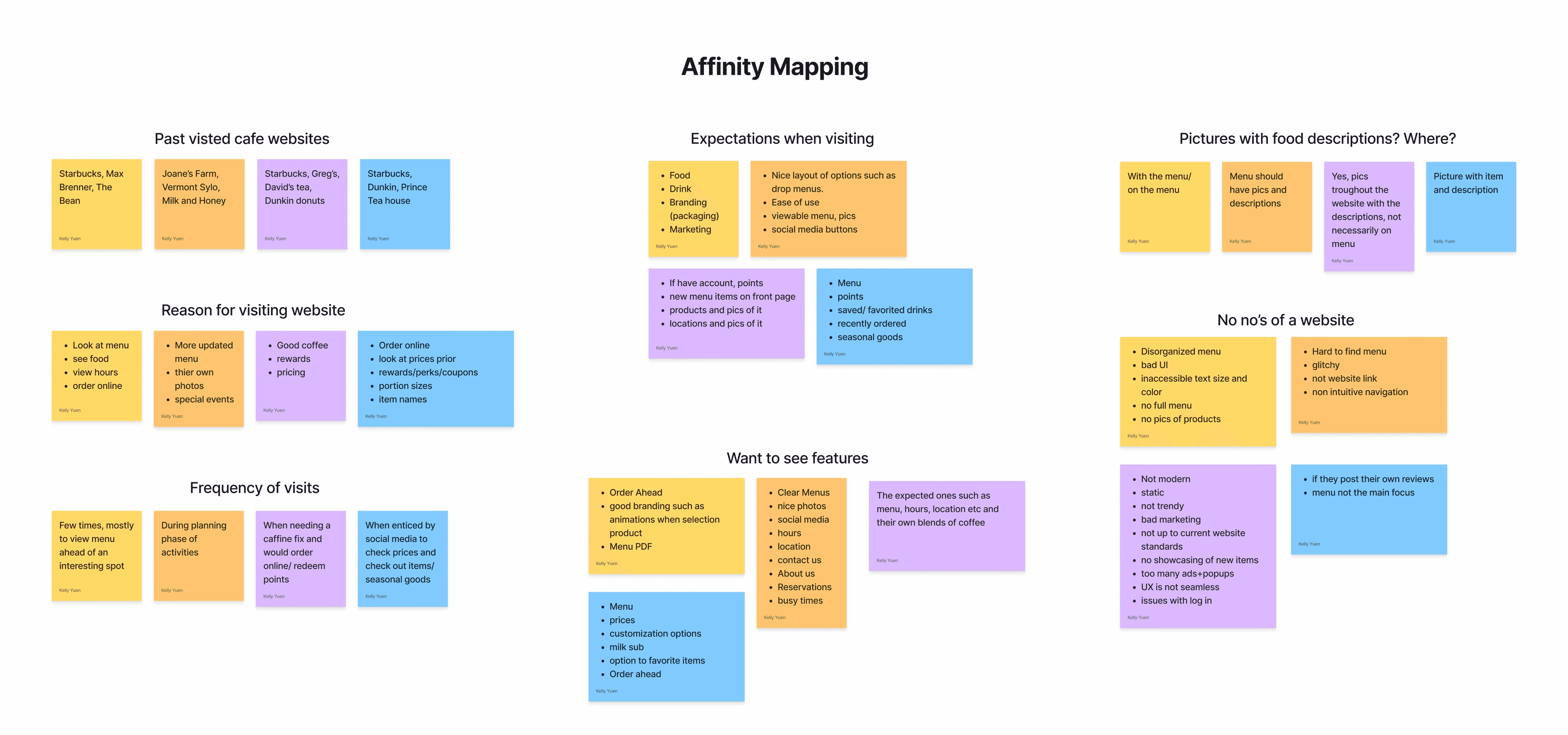
The mains reason for visiting is mainly to look at the menu+prices, order ahead, view photos/check out their products, and see if there are deals/ reward options
Expectations when visiting are having updated menu with accurate pricing and customization options if offered, Pictures and descriptions, Order ahead, Store location, Contact us, about us, Social media and hours
What they don’t want to see are; a disorganized Menu/no menu, Bad UI/ UX not modern (old website format) Glitchy, static, Non intuitive navigation, posting their own reviews, too many ads/ popups, and not having pictures or showing their seasonal/limited goods
Key Interview Findings
Survey Results
Key Survey Findings
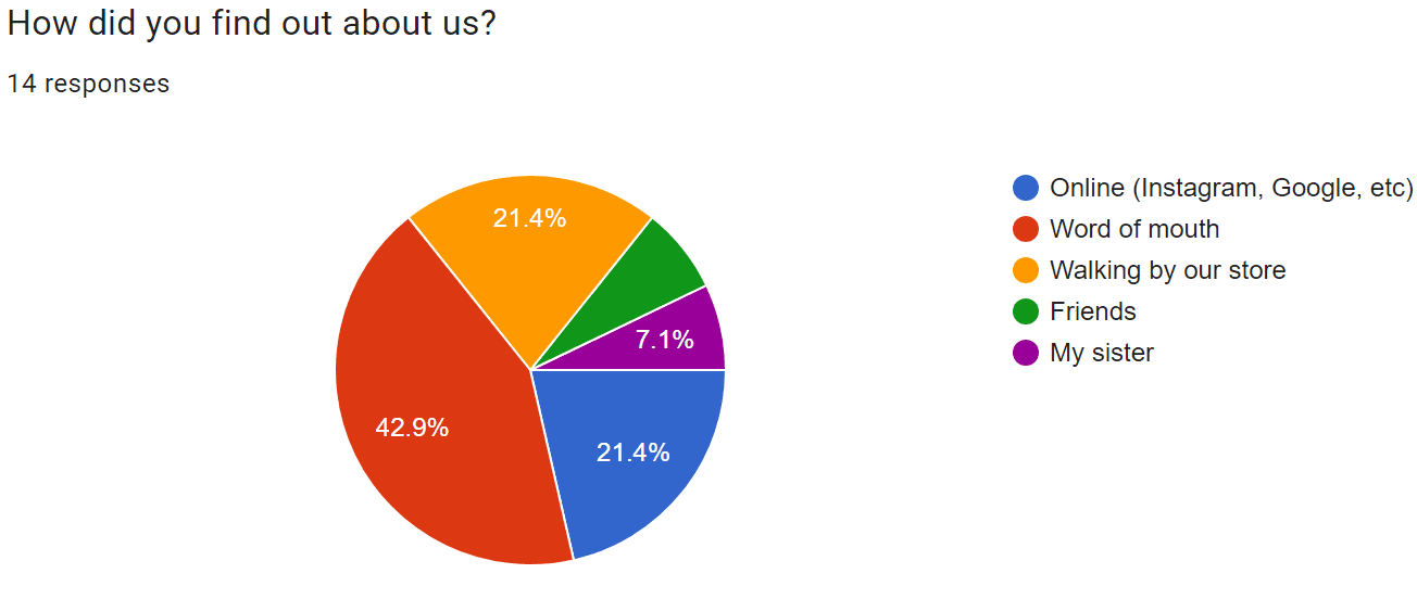
Most found Sip A Cup through word of mouth and a few through online sources
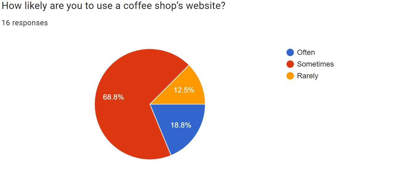
A person would visit a cafe’s website is sometimes. They would visit if interested, but it would not be a frequent occurrence.
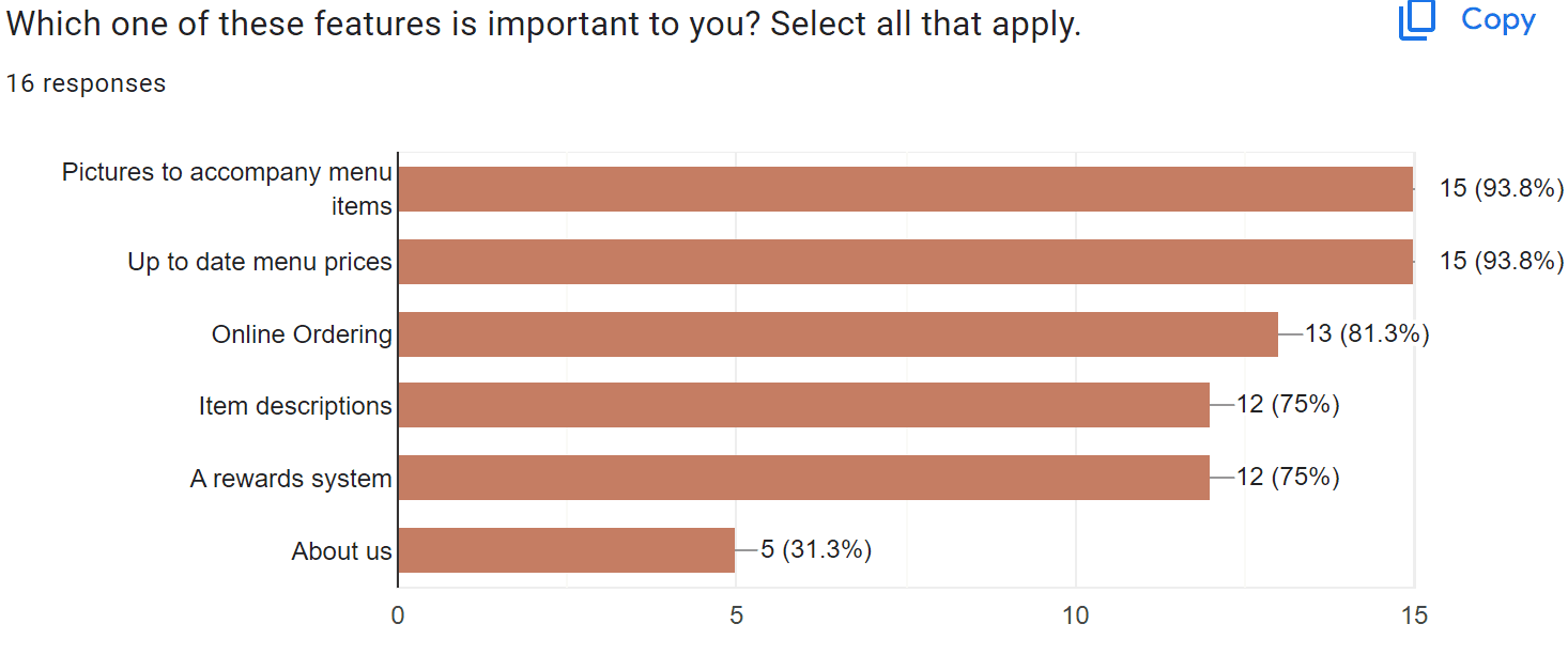
The most important feature to include is Menu with pictures and accurate menu prices. Online ordering for pickup is the second most important feature, considering this is a popular option we might incorporate an online ordering interface in the design
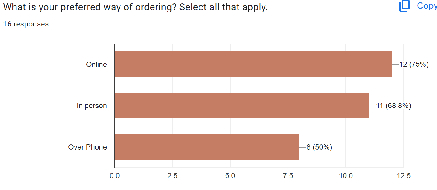
Online ordering is the most preferred way of ordering.
Define: Who is the Demographic and Narrowing the Design Vision
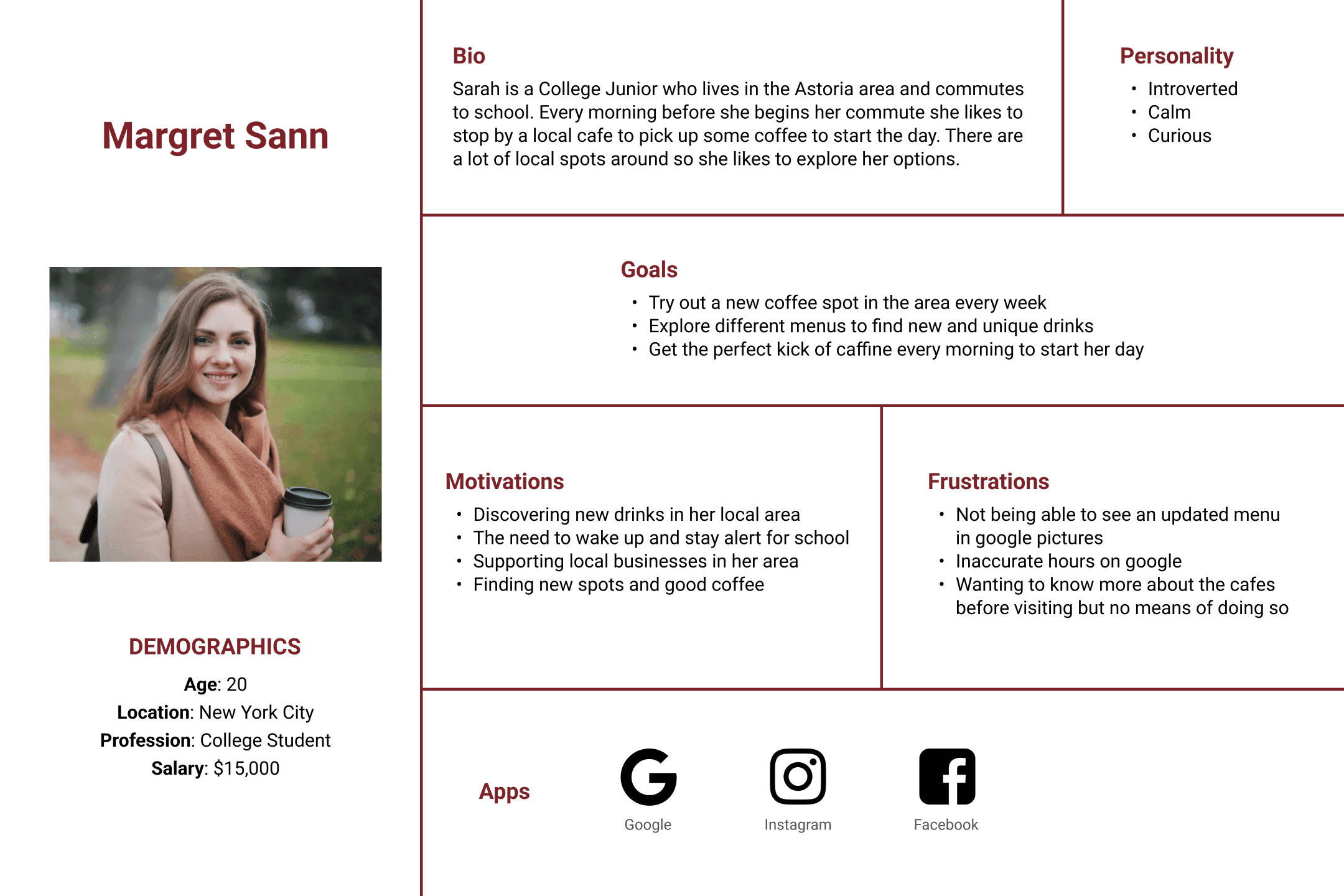
Persona
Margret Sann was created as a potential customer. She is your typical college student who enjoys the affordable options local coffee shops have to offer. Margret like many young people today finds her recommendations online and is disappointed when she is unable to look up a cafe's menu online.

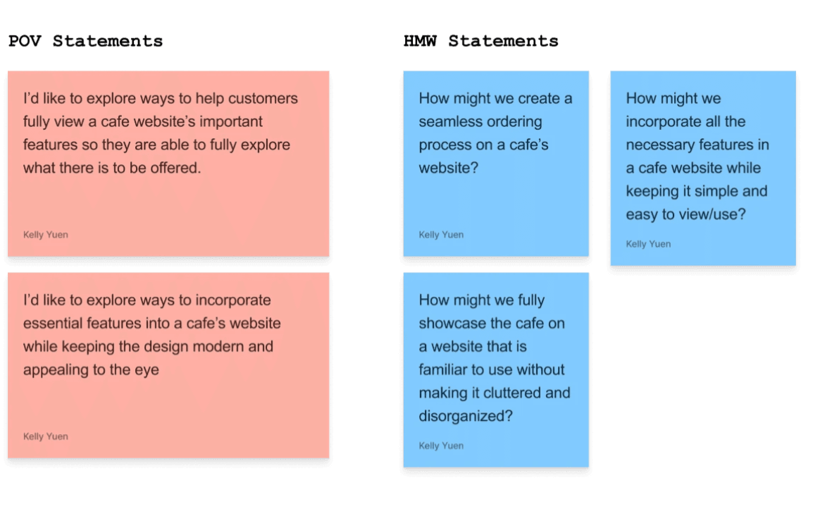
Brainstorming Creative Constraints with POV and HMV
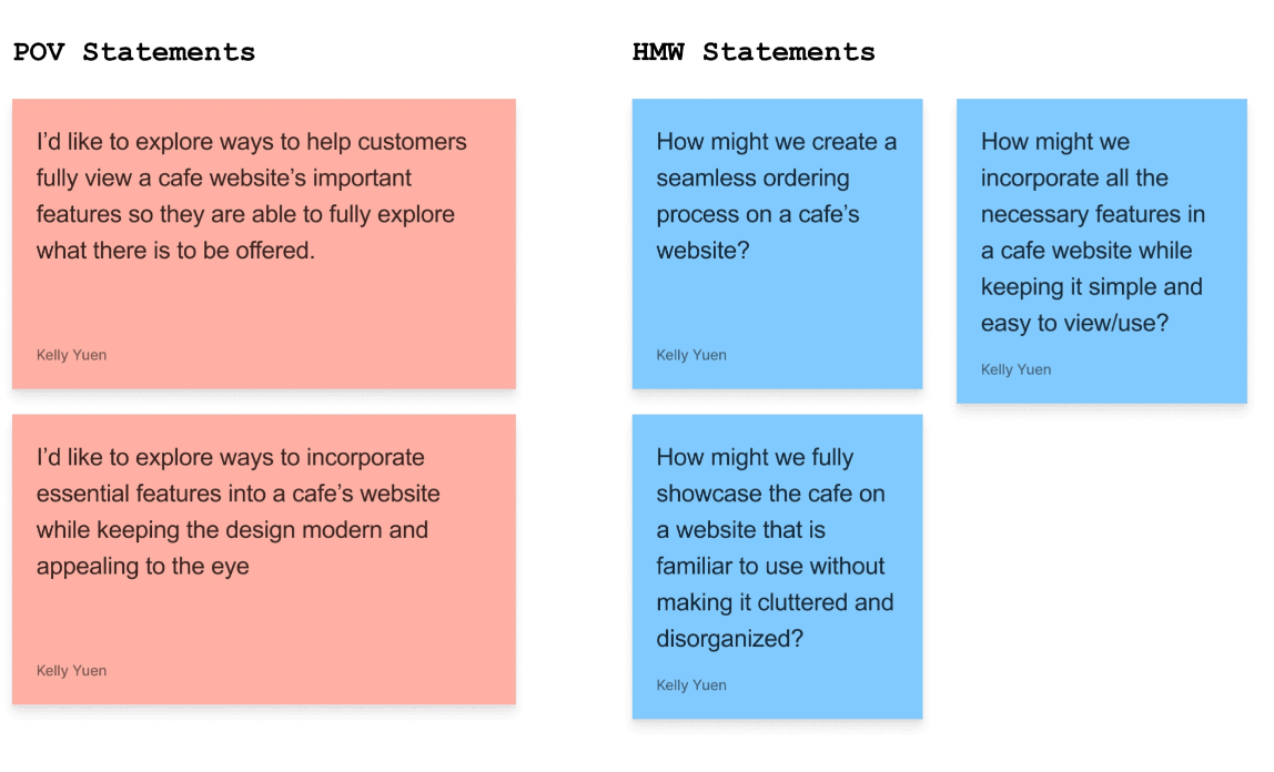
POV and HMW statements were used to help brainstorm design ideas. During my creative constraint brainstorming session I was able to hone in on important features and design ideas:
Make the menu clear and descriptive with prices that are accurate and placed close to each item. Pictures should be included but not too big as they could appear out of place.
Online ordering could be a multiple-step process with indicators to show which step of the process the user is on. With this method, we can minimize clutter on the page and the user can easily go through the steps if needed.
Always include visuals and descriptions to show off products
Keep the color palette simple and minimal to avoid visual fatigue. Perhaps some tones of brown/black against a cream or white
Important information should be front and center such as location/number/hours/menu, perhaps in the hero section
Keep the page simple in order to keep the attention of visitors
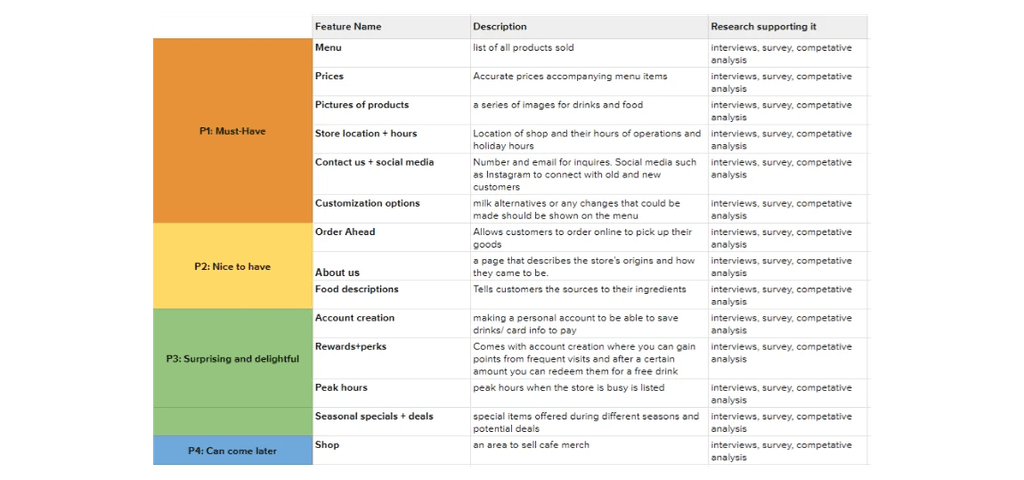
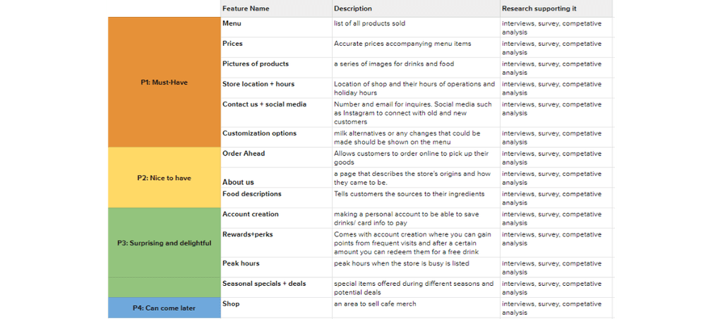
Product Roadmap
Many features were found during my research and a product roadmap was used to organize them in order of importance. Going over the features together with my client, we ordered the features from Must have to Can come later based on the user demand and seen features used by other businesses.
Ideation: Brainstorming and Organizing our Information
Brainstorming Visuals
This site setup will have minimal scrolling and contain mostly clicking to get to desired pages. The website will have a hero section that links to the menu/online ordering. Under the hero section, there will be a photo of the spot with the store location and hours. There will be a contact us section underneath the store hours. On the top navigation bar, there will be a link to the About page, Menu, and Contact Us.
This website will be long in length. The top navigation bar/ action buttons will scroll to a section on the main page. There will be a button to return to the top. Online ordering will bring you to another page
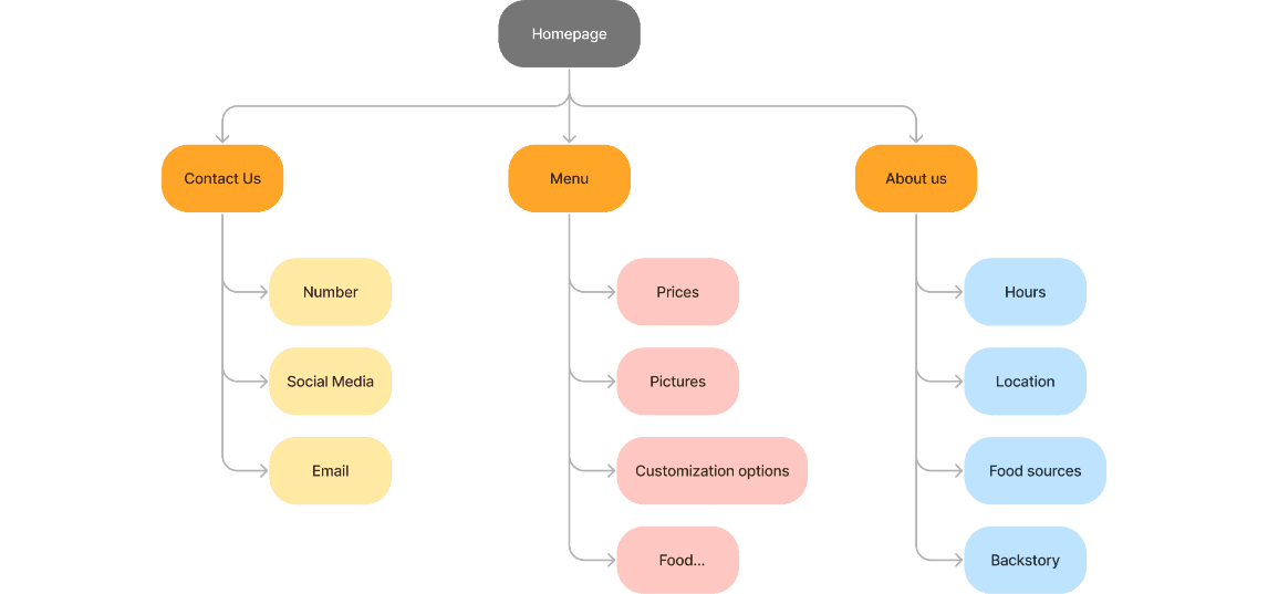
Sitemap
A sitemap was used to organize and categorize the features to be included. The website would have three main links; menu, contact, and about us. Following each of them would be features that belonged in each category.

Design: Putting it all together
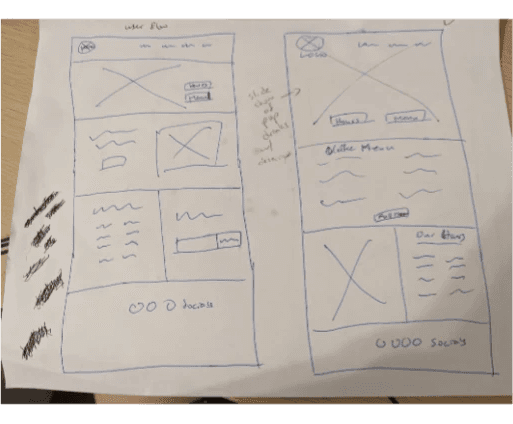
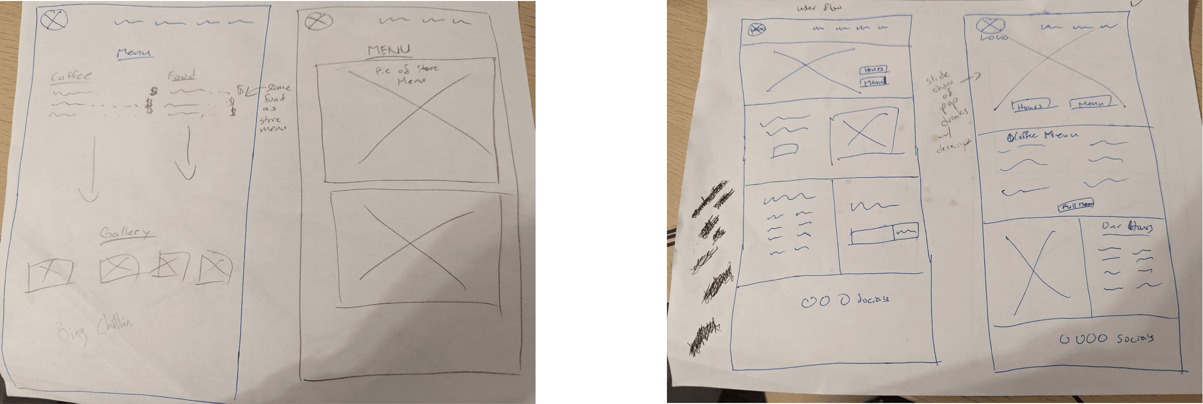
Sketches
I sketched out both ideas on paper, providing a visual for what the design would be. I briefed my client on the 2 options and they decided idea 2 aligned more with their vision. During our meeting we also discussed the inclusion of Online Ordering into the design. Even though initially my client was unsure whether they wanted the option of Online ordering we decided to include due to an abundance of research indicating it to be an important, desirable feature.
Idea 1
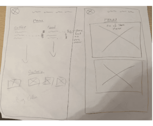
Idea 2
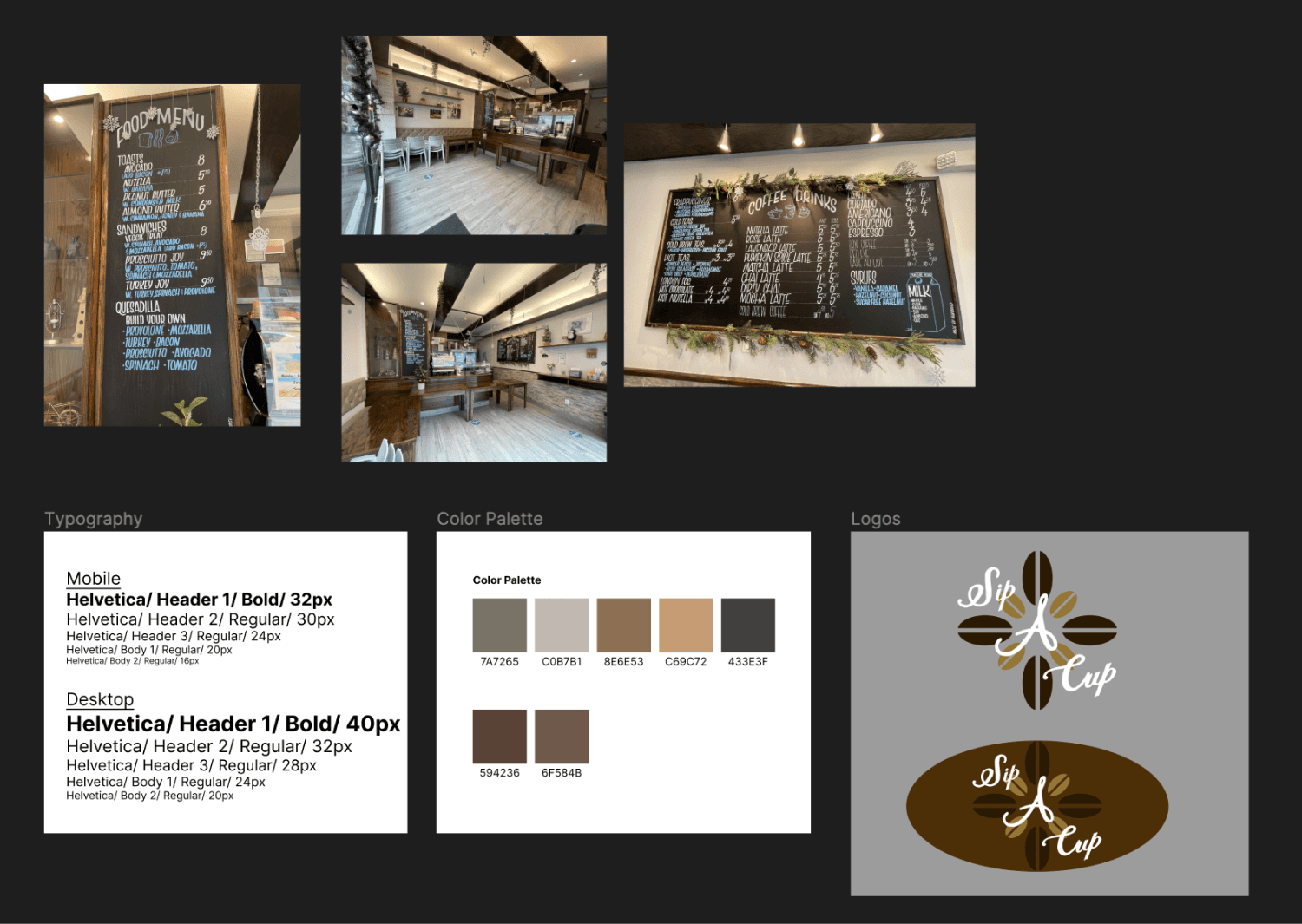
UI Kit
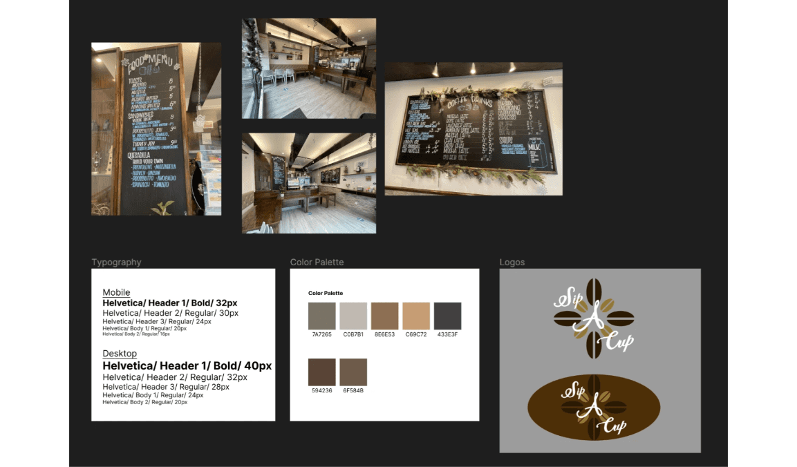
The color scheme and logo were developed from the warm tones of the store interior. Keeping it simple and easy on the eyes I decided to go with a sans-serif font, Helvetica.
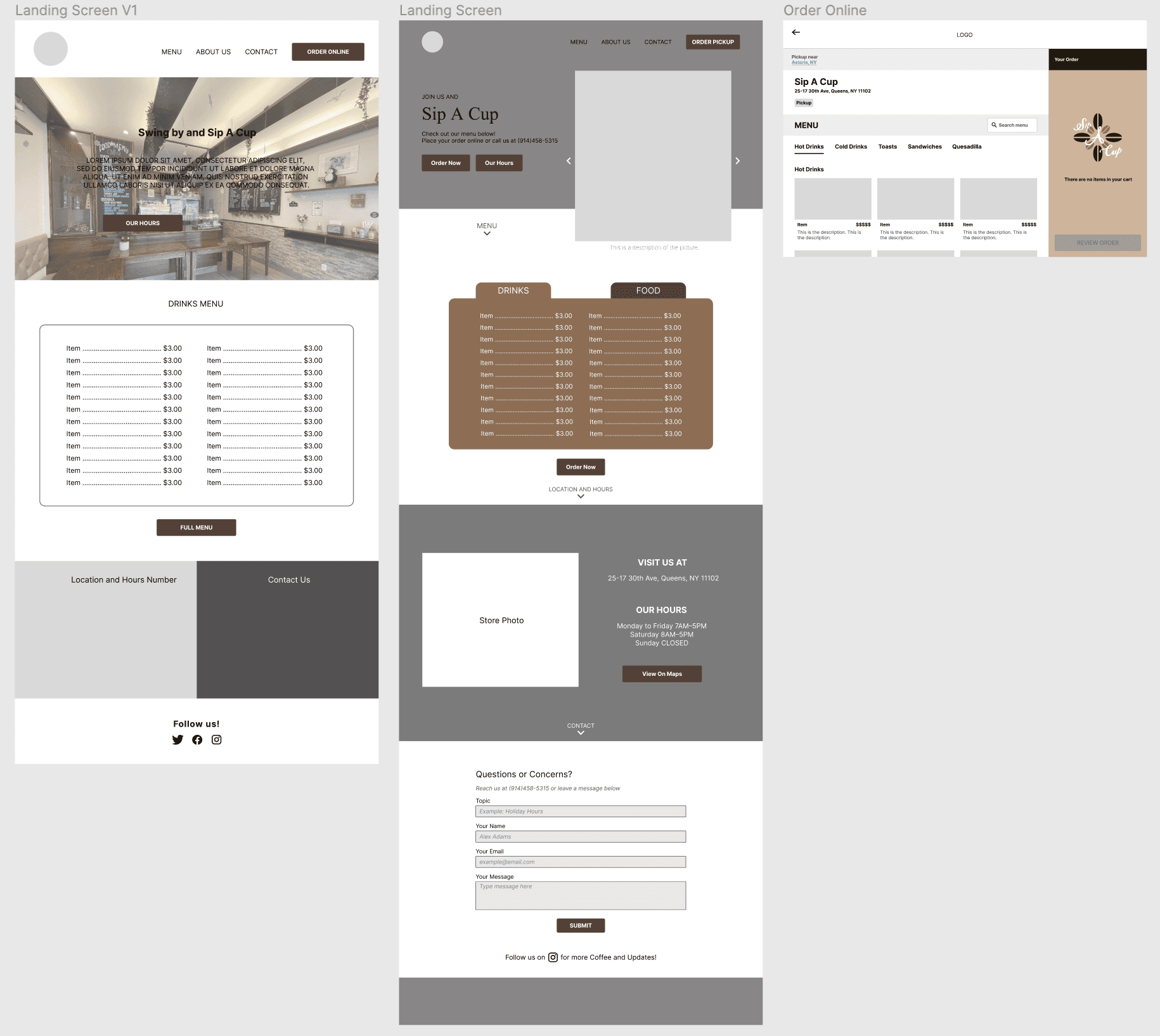
Mid Fidelity Wireframes
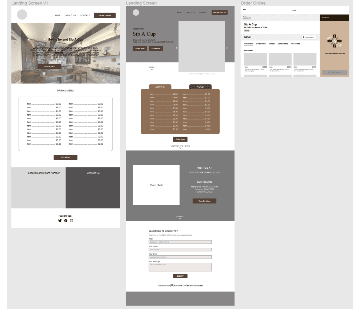
The main homepage of Sip A Cup was created as well as an online ordering page
(left)The very first iterations of the website created the overall picture for what the final website would look like
(middle+right) Final Iteration after feedback from some peers who suggested more spacing for information to be shown.
Every single element from the Roadmap Must Haves were included.
Each section scrolls to the next through arrows that help the user navigate the page.
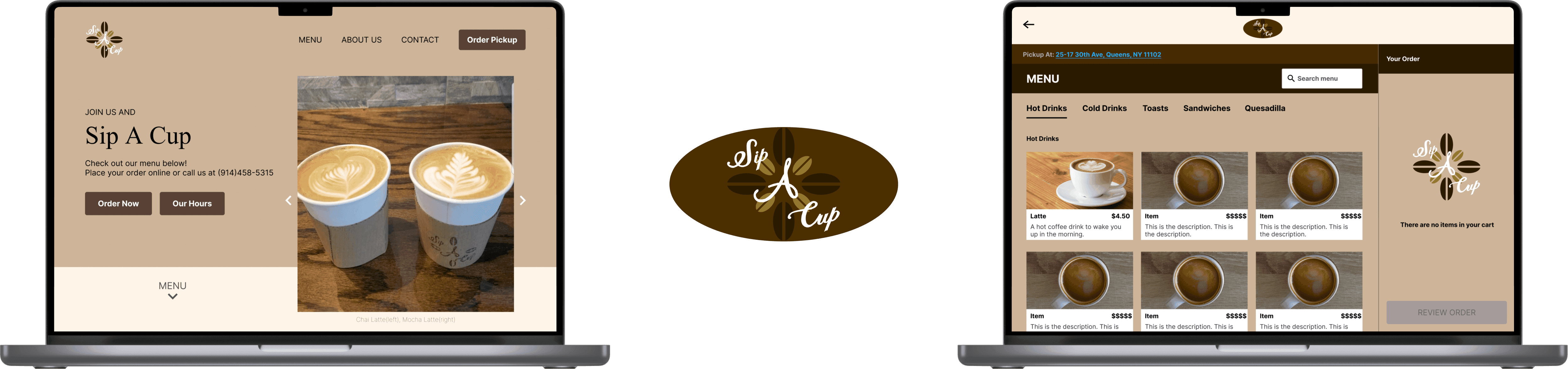
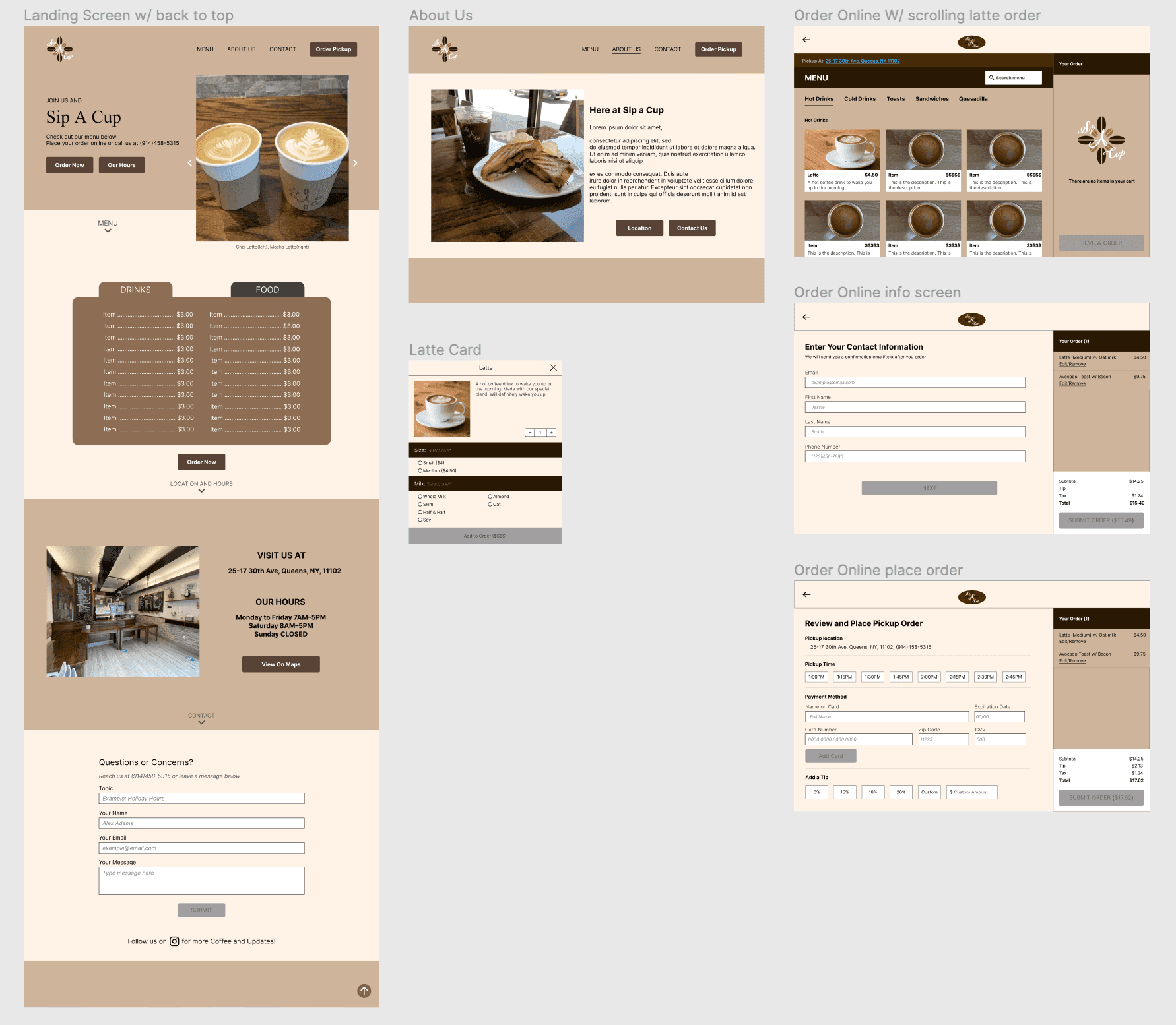
High Fidelity Wireframes (Desktop)
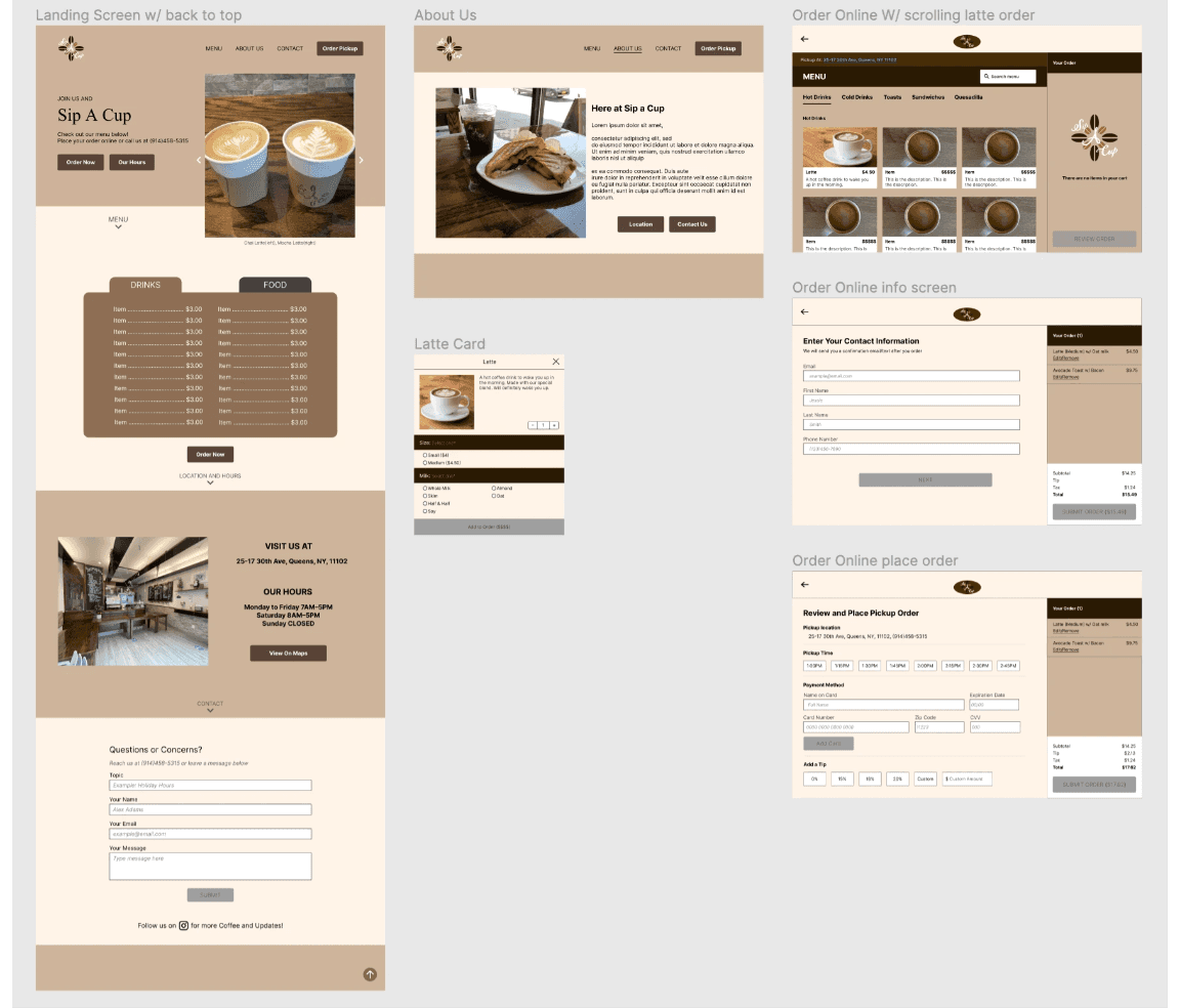
Here we have the final screen of the website.
On the homepage(left) we have buttons on the bottom of each section that brings the user to the next section on the page. This was a unique feature I came up with as a way for the user to quickly navigate through the page without needing to scroll
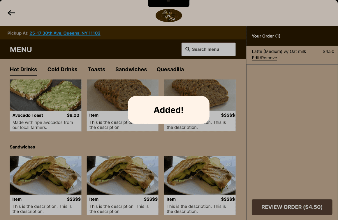
After some feedback I added a full check out process to should how a check out process through this website would be like. It was important to make sure the checkout process was straightforward and intuitive.
The sidebar in the ordering screens were an important add-on as it would prevent order errors since the user can see their order being updated in real time and make any changes on the same screen as the menu.
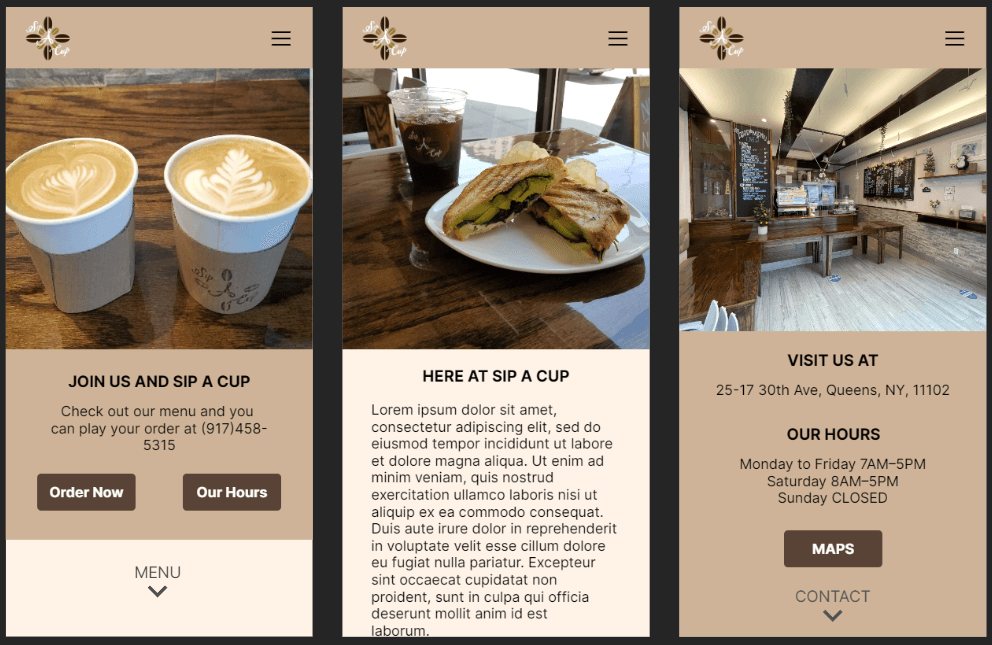
High Fidelity Wireframes (Mobile)
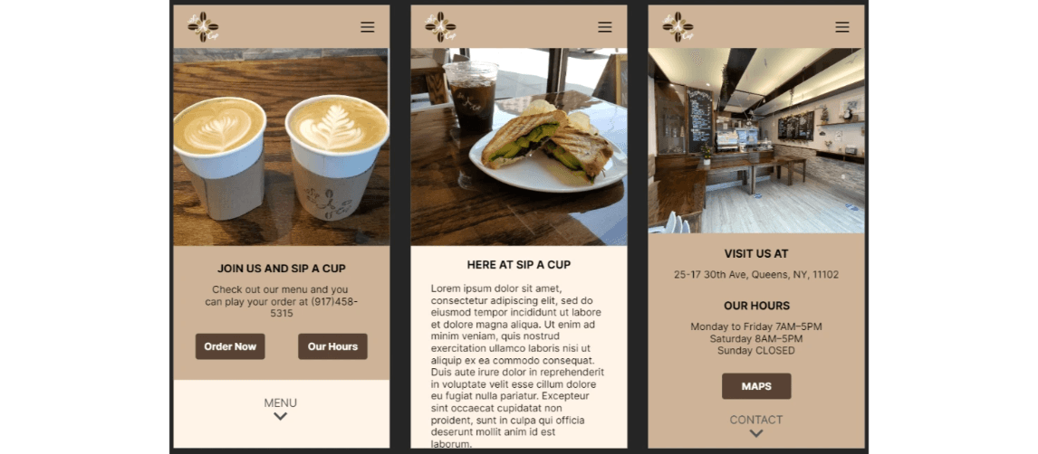
Here we have some mobile screens showcasing responsive web design between desktop and mobile.
The same select button to scroll was carried over from the website
Post Design: Feedback, Reiterations and Final Product
User Testing and Reiterations
A completed prototype was tested by 3 individuals along with my client.
Collectively they thought the prototype was simple and straightforward. They were able to navigate the site quite easily and were able to complete the tasks without much difficulty.
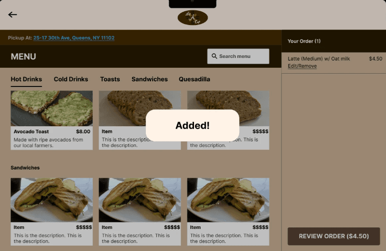
There were some minor changes for accessibility such as an “added” indicator when you add something to your order.
Final High Fidelity Wireframes and Prototype
This prototype shows the entire website and the order online function. Please add a drink and toast before proceeding with checkout
Conclusion
Project Takeaways
This project was my first client experience in the UX sphere. It was a great learning experience as I could hone my client management and communication skills. My client and I had a great time working together throughout the whole process. We were able to see eye to eye on certain design decisions making our teamwork seamless.
Next Steps
Do some more testing for addition feedback
Further iterate on some technical aspects of the website
Decide whether it is feasible to include an order online option.
Setting up the website and going live
Sip A Cup: A Café's first website
Creating a responsive web design for a local coffee-shop's first website
Sip A Cup: A Café's first website
Creating a responsive web design for a local coffee-shop's first website
Role:
UX Researcher, UX&UI Designer, Wireframing, Prototyping
Tools:
Figma, UsibilityHub, Google Meets
Duration:
80 Hours
Role:
UX Researcher, UX&UI Designer, Wireframing, Prototyping
Tools:
Figma, UsibilityHub, Google Meets
Duration:
80 Hours
Background and Problem
For this project I worked together with Sip A Cup to design their first website. Sip A Cup is a family-owned small business founded in 2019 in Astoria, New York. It is a cozy coffee shop/café selling a large variety of drinks such as coffee, tea, and small bites. They have been steadily growing their business and are interested in expanding further by adding an website. With Instagram being their only social media account, Sip A Cup lacks an online presence and wants a well-designed website to establish a digital identity and enhance the overall user experience.
Solution
Create a responsive website that effectively communicates the brand and menu offerings while providing convenient features that enable customers to easily access information and order online. The website should not only attract new customers but also engage and retain existing ones.
Empathize: Learning the Wants and Needs of a Customer
Research Goal
To discover common trends of café websites in order to create a product that is familiar and inviting to new as well as previous customers.
To identify what individuals like and dislike about cafe websites to address common issues one might have with existing cafe websites.
Research Objectives
Understand why people would visit a cafe’s website, and what content they want to see (menu, address, number, etc)
Find out if people usually visit a coffee shop’s website
If ordering online was an option, what do they like/ dislike about the process
Discover common/ popular features of well-known and niche cafes that could be of interest.
Discover unique features that individuals would like to see
Competitive Analysis: Understanding the Market
I examined the websites of Starbucks, Matto, Dunkin and Moa Coffee to gain insights into their online presence and user experience in the cafe industry. By evaluating these competitors, I identified notable strengths and areas for improvement in their website experiences. I was able to gather valuable insights to inform the design and functionality of Sip A Cup's website, ensuring it effectively communicates their brand, showcases their menu offerings, and provides a seamless user experience that attracts and engages customers.
Prioritized minimalist design, visually appealing imagery
They have coffee for a very affordable price and assorted breakfast goods that are not listed on their site
They lack of food menu online, may be due to a changing selection daily at different locations
Well-established and comprehensive website, emphasizing brand storytelling, seamless navigation, and a user-friendly ordering process
They serve all types of Coffee with breakfast, lunch bites and small desserts
They lack enticing deals to bring in more customers
Straightforward menu access and streamlined online ordering
They sell drinks, Famous donuts and breakfast/lunch sandwiches
They have a lot of drinks and food but could have better marketing for their website and app
They are a coffee shop that does coffee, drinks, and baked goods
Their website is missing important information such as a menu and the site has formatting errors
User Interviews and Survey
Both user interviews and surveys were used to understand what individuals expect from café websites as well as gain insight on how my client’s customer base felt about a potential website. I interviewed 4 individuals and conducted a survey with a total of 16 unique responses.
Key Interview Findings
The mains reason for visiting is mainly to look at the menu+prices, order ahead, view photos/check out their products, and see if there are deals/ reward options
Expectations when visiting are having updated menu with accurate pricing and customization options if offered, Pictures and descriptions, Order ahead, Store location, Contact us, about us, Social media and hours
What they don’t want to see are; a disorganized Menu/no menu, Bad UI/ UX not modern (old website format) Glitchy, static, Non intuitive navigation, posting their own reviews, too many ads/ popups, and not having pictures or showing their seasonal/limited goods
Survey Results
Key Survey Findings
Most found Sip A Cup through word of mouth and a few through online sources
A person would visit a cafe’s website is sometimes. They would visit if interested, but it would not be a frequent occurrence.
The most important feature to include is Menu with pictures and accurate menu prices. Online ordering for pickup is the second most important feature, considering this is a popular option we might incorporate an online ordering interface in the design
Online ordering is the most preferred way of ordering.
Define: Who is the Demographic and Narrowing the Design Vision
Persona
Margret Sann was created as a potential customer. She is your typical college student who enjoys the affordable options local coffee shops have to offer. Margret like many young people today finds her recommendations online and is disappointed when she is unable to look up a cafe's menu online.
Brainstorming Creative Constraints with POV and HMV
POV and HMW statements were used to help brainstorm design ideas. During my creative constraint brainstorming session I was able to hone in on important features and design ideas:
Make the menu clear and descriptive with prices that are accurate and placed close to each item. Pictures should be included but not too big as they could appear out of place.
Online ordering could be a multiple-step process with indicators to show which step of the process the user is on. With this method, we can minimize clutter on the page and the user can easily go through the steps if needed.
Always include visuals and descriptions to show off products
Keep the color palette simple and minimal to avoid visual fatigue. Perhaps some tones of brown/black against a cream or white
Important information should be front and center such as location/number/hours/menu, perhaps in the hero section
Keep the page simple in order to keep the attention of visitors
Product Roadmap
Many features were found during my research and a product roadmap was used to organize them in order of importance. Going over the features together with my client, we ordered the features from Must have to Can come later based on the user demand and seen features used by other businesses.
Ideation: Brainstorming and Organizing our Information
Sitemap
A sitemap was used to organize and categorize the features to be included. The website would have three main links; menu, contact, and about us. Following each of them would be features that belonged in each category.
Brainstorming Visuals
This site setup will have minimal scrolling and contain mostly clicking to get to desired pages. The website will have a hero section that links to the menu/online ordering. Under the hero section, there will be a photo of the spot with the store location and hours. There will be a contact us section underneath the store hours. On the top navigation bar, there will be a link to the About page, Menu, and Contact Us.
This website will be long in length. The top navigation bar/ action buttons will scroll to a section on the main page. There will be a button to return to the top. Online ordering will bring you to another page
Design: Putting it all together
Sketches
I sketched out both ideas on paper, providing a visual for what the design would be. I briefed my client on the 2 options and they decided idea 2 aligned more with their vision. During our meeting we also discussed the inclusion of Online Ordering into the design. Even though initially my client was unsure whether they wanted the option of Online ordering we decided to include due to an abundance of research indicating it to be an important, desirable feature.
Idea 1
Idea 2
UI Kit
The color scheme and logo were developed from the warm tones of the store interior. Keeping it simple and easy on the eyes I decided to go with a sans-serif font, Helvetica.
Mid Fidelity Wireframes
The main homepage of Sip A Cup was created as well as an online ordering page
(left)The very first iterations of the website created the overall picture for what the final website would look like
(middle+right) Final Iteration after feedback from some peers who suggested more spacing for information to be shown.
Every single element from the Roadmap Must Haves were included.
Each section scrolls to the next through arrows that help the user navigate the page.
High Fidelity Wireframes (Desktop)
Here we have the final screen of the website.
On the homepage(left) we have buttons on the bottom of each section that brings the user to the next section on the page. This was a unique feature I came up with as a way for the user to quickly navigate through the page without needing to scroll
After some feedback I added a full check out process to should how a check out process through this website would be like. It was important to make sure the checkout process was straightforward and intuitive.
The sidebar in the ordering screens were an important add-on as it would prevent order errors since the user can see their order being updated in real time and make any changes on the same screen as the menu.
High Fidelity Wireframes (Mobile)
Here we have some mobile screens showcasing responsive web design between desktop and mobile.
The same select button to scroll was carried over from the website
Post Design: Feedback, Reiterations and Final Product
User Testing and Reiterations
A completed prototype was tested by 3 individuals along with my client.
Collectively they thought the prototype was simple and straightforward. They were able to navigate the site quite easily and were able to complete the tasks without much difficulty.
There were some minor changes for accessibility such as an “added” indicator when you add something to your order.
Final High Fidelity Wireframes and Prototype
This prototype shows the entire website and the order online function. Please add a drink and toast before proceeding with checkout
Conclusion
Project Takeaways
This project was my first client experience in the UX sphere. It was a great learning experience as I could hone my client management and communication skills. My client and I had a great time working together throughout the whole process. We were able to see eye to eye on certain design decisions making our teamwork seamless.
Next Steps
Do some more testing for addition feedback
Further iterate on some technical aspects of the website
Decide whether it is feasible to include an order online option.
Setting up the website and going live