

Background
Although time-consuming many people cook at home. Home cooking is a great way to save money, eat healthier, and bond with friends and family. If you’ve ever cooked before, you may notice that oftentimes there are ingredients left over. The following week you could be scratching your head wondering how to use them. The internet is a great resource to look for recipes but there is a lack of other necessary ingredients to complete the dish. After weeks of pondering the ingredients are left untouched and they end up spoiling.
Problem
It could be a challenge to brainstorm and research recipes to repurpose miscellaneous ingredients around your home. Leftover ingredients eventually spoil and get thrown out due to inadequate portions for the same recipes, or just a general lack of knowledge on how to use them.
Solution
Create a unique way for people to search and discover recipes by getting recommended recipes based on existing ingredients in which they can search, filter, and favorite.
Research Goal
To understand the need for a recipe generator through the common ways people search for recipes, and important features typical of a recipe app.
Research Objectives
Would this app be useful or a staple in someone’s routine?
What are the struggles of coming up with recipes from random ingredients?
Could this app improve someone’s cooking routine?
What are some essential features to include in the app?
User Interviews, Understanding the Need
I started off by interviewing some individuals on their home cooking routines. Would they think a tool such as a recipe generator be useful and how could it improve their routine?

Key Interview Findings
100% of them:
Often cook at home and have leftover ingredients
Turn to an external source for recipe lookup such as a cookbook or the internet (YouTube especially)
Are open to cooking recipes from new cuisines
75% of them:
Are spontaneous with what they decide to cook
Believe the app would be helpful by providing inspiration and saving the trouble of manual recipe lookup
Overall there is a positive response to the recipe generator app with majority believing it would be a helpful tool to their routine and save them time. However, there are concerns regarding it's ease of use, would it be worth using over just tradition recipe lookup.
Competitive Analysis: Gaining Insight of Industry Peers
Next, top-rated, recipe-generating apps were compared to get a grasp on current standards and common features that are included.


Define: Analyzing the Research
Main Points to Address
Wants
Quality of life features that would make the app more appealing to use.
Examples include: allowing users to save their pantry items and Speech-to-text to add ingredients
Pain Points
Too many features crowd up a screen making it hard to use.
Organization of all the different information is needed to mitigate visual fatigue.
The lack of informational architecture, scaling, and app structure makes the app frustrating to navigate and memorize. These elements should be the main focus
“How might we design an app that incorporates necessary features without being cluttered?”
Persona
From my research, it was clear a recipe generator would be beneficial for an array of people who cook at home. Laura was created to visualize the working class demographic that could use a smart tool in their cooking routines. Her key frustrations are her lack of time and energy to search and cook intricate recipes.

Product Roadmap
Many features were mentioned during my research and I used a product roadmap to organize them. The features I decided to focus on were mainly for ease of use and clear organization + navigation through the app.
Must-Have
Filter System
Full Recipes
Favoriting recipes
Video tutorials
Pantry
Profile
Nice to Have
Nutrient facts
Speech to add
Rating Recipes
Surprising and delightful
Dietary restrictions
Cooked counter
Recipe portion conversion
Meal planning
Can come later
Blog
Community page
Ideation: Brainstorming
Visualizing the App with Sketches
Two main ideas were conceptualized;
The app would have 4 main tabs on the bottom navigation each labeled as a different section, Pantry/ Recipes/ Favorites/ Profile. Each tab will have its respective content. This is a common format that is familiar to users who use apps such as Instagram, Twitter, YouTube, etc. It is organized and structured so that way the user can navigate through the app intuitively.
The app has a homepage where within it there are sections where you have your pantry and recipes. Your profile and favorites will be located on the sides. This format is organized but structured in a way for users to explore on their own.


After sketching out both ideas I decided to go with Idea 1’s (left), which was a more intuitive design
Sitemap
A sitemap was used to further break down and elaborate on Idea 1. The informational architecture was organized based on similar layouts from competitors and included features mentioned in the product roadmap. The Pantry and Recipe section would be utilized the most due to the constant adding and removing ingredients following up with searching and filtering recipes.

Task Flows
Two flows were created to visualized the user's main interactions with the system.
The first task flow (top) is the main flow users will be following while using the app. The process of adding and removing ingredients to look up recipes is the core function of this app.

Design
UI Kit and Mid-fidelity Wireframes
Before moving forward with wireframing I had to establish the app's identity with a name, logo, and color scheme. I came up with the name CooKit for it's duel interpretation. One refers to the app as a cooking kit for your ingredients. The other refers to the simplicity of looking up recipes prompting the user to just “cook it”.
The Logo was created the help of irasutoya. I was able to play around with the name and fun colorful icons, ultimately deciding on a firey pan due to its cute visual that displayed the brand name perfectly with its simple details.

The color palette was a tricky to hone, I initially wanted all the colors from my color palette and applied it to my Mid-fidelity wireframes shown below

The results ended up looking tacky and I decided to stick with only the colors from the homepage. The blue and white reminded me of fridges, fitting the theme of the app.
High Fidelity Wireframes
Onboarding- we go through the sign up flow before access to the homepage. It would be necessary to create an account in order to save your ingredients.
NOTE: the process of adding ingredients prior to accessing the homepage is not shown due to it being a feature that could be added on later.

All of our Must have and Nice to have features were added into the app shown below


Full Recipes
Video tutorials
Nutrient facts
Rating Recipes
User Testing and Results

A Usability test was conducted on UsabilityHub to measure the rate of success users had with navigating the app and how well they could complete tasks of adding ingredients, searching and favoriting recipes.
11 people tested the prototype between the ages 20-34
73% reached the goal screen
Average of 54 clicks by those who reached the goal screen
Of those 13% had mis-clicks
Overall testers thought the app was easy to navigate and intuitive with a few hiccups due to not fully understanding the instructions
Feedback Grid
Using a feedback grid I noted down some pain points and was able to pinpoint areas of my app that worked, questions testers had, areas that needed change, and ideas to help with those changes.

Key Changes Made
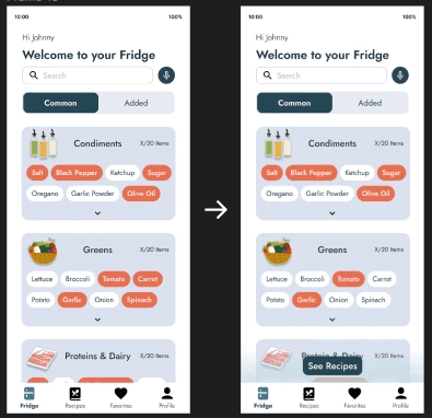


The filter popup was changed to reflect the new button on the filter bar. The popup includes all the filters you can apply and you are able to go into each section to add as many as you want.
Final High Fidelity Wireframes and Prototype
Conclusion
Project Takeaways
This was a project I had a lot of fun researching and designing.
With the feedback I got from my user testing, I further refined my design and added some necessary UI changes such as the CTA button on the common food page and the updated filter bar.
I needed to pay more attention to my user testing instructions and crafting user task flows that don't require specific instructions.
A problem that kept coming up was unclear instructions that led to user error. Some testers mentioned without the user task prompt the app itself was very intuitive and self-explanatory.
Next Steps
Test the reiterated design for more feedback on improvements such as adding an optional screen during the signup process that has the user add up to 5 existing ingredients before proceeding into the app. This would start familiarizing the user with how the app functions.
Incorporate features that were not a priority while making the MVP
Establishing a search engine for recipes through using AI or internet scrubbing recipes